2018 - 2020 • Lead design ux/ui • team management
Map production tools and SERVICEs
“How I was asked to redesign an internal tool, but ended up leading the design for an overhaul of the company’s internal tooling processes, from strategy to execution.”
Case study content:
Discovery research
Solution strategy
Definition and design
Results and iteration
Reflection
The majority of my time at HERE I’ve had managers who were not in the design field. While this made goal settings and evaluations a tad more complex, it provided me with loads of insights into the technical aspects of our company. In this case, the company’s map product buildout processes, which create the map data powering all of HERE’s internal and customer facing products.
Initially I was tasked with a redesign of the user experience and the user interface of one of the tools used in this process, but I ended up updating the whole suite of tools and services, creating a design system for it, and was even given the responsibilities to manage a small team of designers to support this cause.
1
The problem space
Some background info up ahead
Creating an accurate digital representation of the world is hard work; keeping it up-to-date is even harder, and frankly impossible without Machine Learning (ML) as an integral part of the process. For map building purposes, those ML operations are often detectors, capable to identify real world objects from photographic or LiDAR based imagery. This way, the main labor is to collect new images of the world, while the processing and updates happen automatically.
However, those detectors don’t create themselves and won’t function as intended if not trained properly. Also, none of these detectors will run smoothly from day one. Their output must be verified and corrected if needed.
In short: automation requires a lot of manual labor by dedicated professionals using software specifically built to support the cause.

Unfortunately, but also unsurprisingly, the tools that have been built internally to serve those users in producing and checking the company’s core map product, often sport a subpar design; not just from an aesthetic point of view (though most definitely), but in terms of workflow, reliability, and error prevention - the basic principles of good UX design and
the things that matter for the bottom line of the business. As mentioned in the intro, I was initially asked to quickly redesign one of these tools, but the need to understand the process as a whole first in order to repair one cog in the machine led me to dive deeper into this existing potpourri of software.

I was able to convince my manager (who was also the engineering lead for this tooling effort) to spend more time on this topic. I wasn’t interested in putting “lipstick on a pig”, but was very excited about the opportunity to apply some
product/design thinking methodologies in order to find a solution that will improve the overall quality of the tools and the user experience of the people who have to work with them for 8 hours a day.
2
Discovery research
Pain points and root causes

During the next few weeks I reached out to colleagues involved in the map buildout process: data scientists, engineers, ML operation specialists, work force managers, etc. Very technical, very R&D (and HR); very exciting when it works, very demoralizing when it doesn’t.
Most of the people were aware of the lackluster arrangement of tools, and that it had a negative impact on the users and output. But they also felt blocked to improve things, being tied to deliveries and roadmaps.
They recognized the benefits of having product designers working on user facing software, even though some had the initial believe that this means making buttons look pretty.
The following is a summary of my research. I tried to get a better understanding of the bigger picture: what are the business needs? Who is the impacted audience? What’s the problem space? Where are the current issues that block the success?

Few surprises on the business side: increase market to get new customers and make existing ones happy.
And cut those production costs while you’re at it.

Spread out across the globe, the groups involved in the process had a lot of interdependencies, both in the flow of the process and in their goals.
For example: if the work force doesn’t meet their goals, then their managers can’t deliver the content, which means the stakeholders can’t lower development times.

I quickly realized that the tools themselves were just one layer that needed to be tackled from a design POV.
The other ones were about supporting the people in the process, and a whole lot of bureaucratic operations that keeps the ball rolling.

The sheer scale, mentioned before, was another aspect that needed to be pointed out. If the end goal was global reach, then we’re talking about millions of km of road network spread across hundreds of countries with their own rules and regulations.

A look into the day-to-day revealed issues on the more operational side. Tools were built and updated on feature requests, not job stories; stakeholder weren’t managed; the engineering team was not frontend code savvy; overpromise, underdeliver.
Having poorly designed and built tools as a result was a logical consequence.
When discussing the results with my manager we came to the conclusion that most of the problems discovered, from tool production to usage to throughput of map data, revolved around one specific aspect: process efficiency. And while we wouldn’t be able to solve all problems by ourselves, having control over the design and development opened up some possibilities.
Of course, developing and designing so close to the “bleeding edge” means dealing with ambiguity, uncertainty, and a healthy amount of chaos. Many paths have yet to be explored and many more problems have yet to be stumbled upon. The proposed solutions needed to take those aspects into account as well.

3
Solution strategy
Deep dive into the what & how

Transforming this focus on efficiency into tangible design solutions required further deep dives. Luckily, I didn’t have to work on this all by myself: 1 designer in Berkeley, as well as 2 designers and a newly hired design researcher in Mumbai, joined me in this effort to improve the efficiency and user experience of HERE’s map buildout tooling.
To gather requirements and better understand what we were dealing with, we organized an initial kickoff workshop in Mumbai with relevant stakeholders. Afterwards we set out to analyze the existing tools, workflows, work environments, and internal processes.

We went from high level user journeys down to current keyboard commands used in existing tools and other production software (i.e. Adobe suite, 3D Studio Max).
The findings and proposals we ideated were regularly reviewed with key stakeholders to make sure that we stayed in the realm of possibilities and to create a sense of co-ownership.
This had the positive side effect of establishing good relationships and trust with everyone involved and being invited to more technical workshops and discussions, thus providing insights needed to get the job done. Having those close ties is essential if you want to change a bigger picture - you can’t just push a design and call it a day.

While not able to reshape the overall process, we proposed and established some practices into the existing operations that were more design/product thinking oriented.

To figure out how to make tools more efficient, I mapped the existing and upcoming applications on a grid.
This helped me to discover commonalities and patterns - useful for design and development.
In addition, I mapped out the user journeys for the two main types of workflows, first on a detailed level, then on an abstract one; again, the focus here was to find similarities and consistency.

As the tools became more efficient to operate, so did the support layer. We needed to reduce time spent onboarding and time wasted waiting for answers on a specific problem that hindered progressing in the current task.
I analyzed websites and wikis that provide guidance and troubleshooting, tutorials, and training sessions to onboard users, as well as tools that allowed users to allocate the workforce as needed.

Looking at both tools and support services, their interconnectivity throughout the user’s journey became evident: switching from working to looking something up or providing help happened constantly and needed a more instant, seamless transition.

Finally, the key piece: as we uncovered patterns and what looked to be common components across the tools and services, we realized that by transforming the development efforts into building tools out of components, the team would be able to support more stakeholders, while keeping everything consistent.
Following the guiding light of making everything more efficient, we found a solution that we deemed future proof: design and build tools based on components. This would guarantee consistency, lowered efforts in the long run, and easier maintenance.
The question was: what would the end user experience be like, and could there be a way to give stakeholders some control over using those components themselves?
Definition and design
Guidelines, flows, UX, UI
4

The first idea for a product was one that looked great on paper and in the eyes of stakeholders, but ultimately clashed with the realities of the work environment.
As we thought of component-based solutions, I proposed the idea of creating a “tool creator”, a web-based service aimed at data scientists that would allow them to build their own tools.
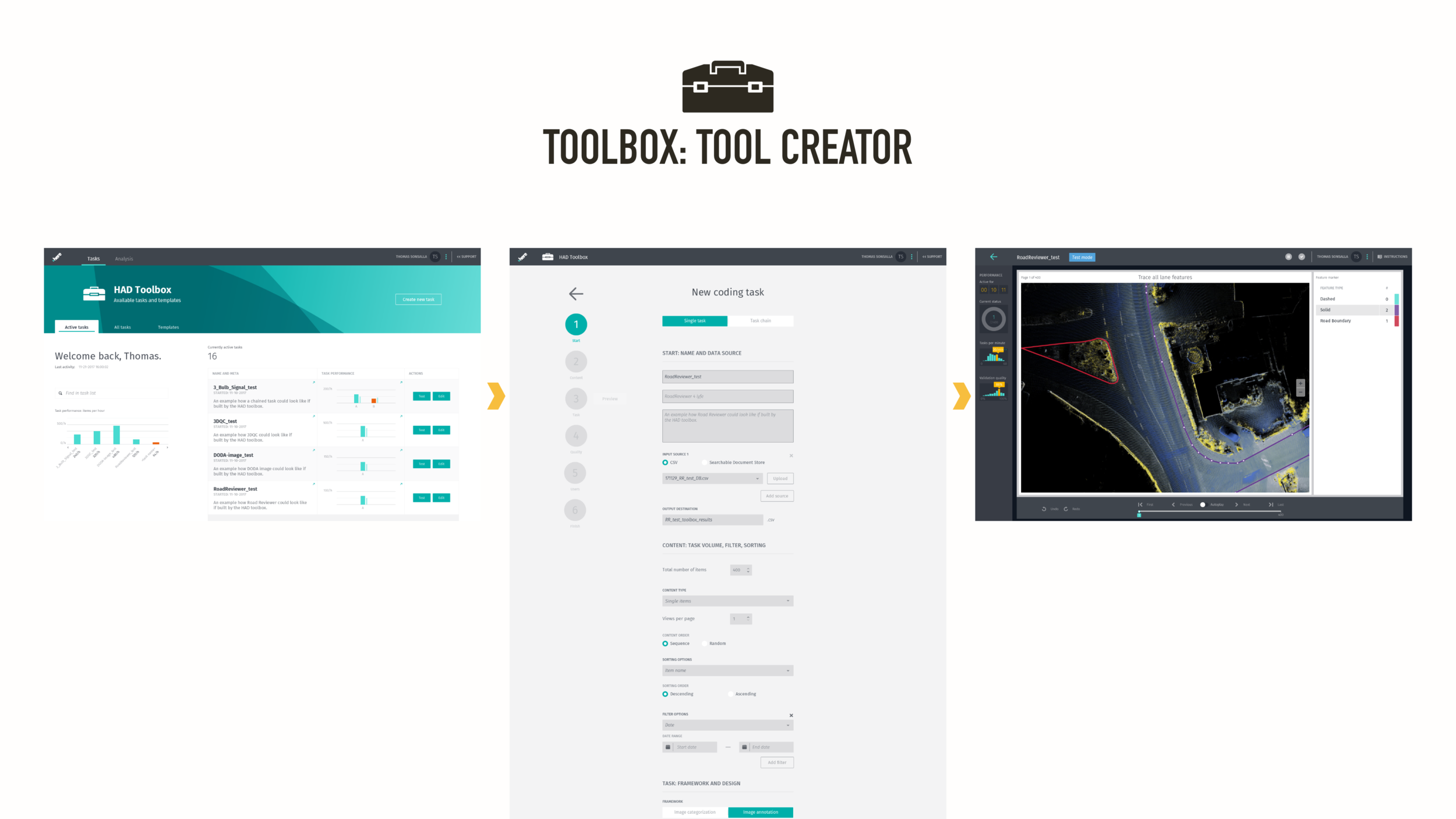
The flow would be straightforward: from a home screen the user can monitor existing processes or setup a new tool. This setup lets users select the type of tool (creation, reviewing), the type of data, the amount of users, the QC processes, and other things required. After submitting, the system generates a tool based on existing components and sends it off to end users who would work on it for a set period of time.
This idea didn’t pan out for a couple of reasons: at the time it was deemed infeasible to create by the engineering team due to existing requests and lack of experience in this field. Also, the stakeholders, while liking the concept, didn’t think their needs for new software would be continuously high over multiple years to justify investing the time to build this tool creator.
However, the component-based approach struck a nerve with everyone involved.


While the whole creation system fell flat, the engineering team agreed to shift their focus to a component-based tool development. This was ultimately good for the end user, the stakeholders, and the business. It also put a healthy pressure on the design team to ensure those components would work across stakeholder needs.
So, with that pressure we finally set out to get started on redesigning the tooling experience.
The following and other specifications on a more global scale helped us in the design team to work more consistently and within set boundaries.

Holistic solutions that need to work within a fuzzy realm of requirements require a rock-solid foundation. Therefore I started out setting up the information architecture and component nomenclature, on which everything else would be designed. Grids, colors, typography, and other shared attributes would follow.

With the baseline set, UX patterns needed to be defined, often down to the most basic ones, such as creating a vector point or a polygon.

Other aspects that are considered “out of the box” had to be “reverse designed” and specified (remember the lack of frontend experience in the development team) to ensure a common behavior across all tools, such as camera movement in 2D and 3D spaces.

I was keen on keeping everything in the UX and UI consistent, that included re-mapping keyboard commands in a way that’s logical, ergonomic, and expandable.
In addition to defining the end user experience down to the smallest required detail, I also worked with operations managers and data scientists to figure out ways how to translate their current work flows and processes into application flows, for example in the areas of Quality Control and feedback escalation.
This had an interesting synergy effect, as me trying to understand their process, asking a lot of “outsider” questions
and designing towards simplifying the mental load for the end user also helped said stakeholders to discover different, simpler approaches.
After various workshops, presentations and discussions, those co-created flows were documented and used as basis for the UX and the underlying processes.

Over the course of a couple of months the design team and I created, tested, and iterated upon our set of guidelines, specifications, and detailed design components.
In parallel we started to work on designing the first set of tools that would follow this new set of specifications. A great way to put theory into practice and learn from usability testing.
5
Results and iterations
After release is before release

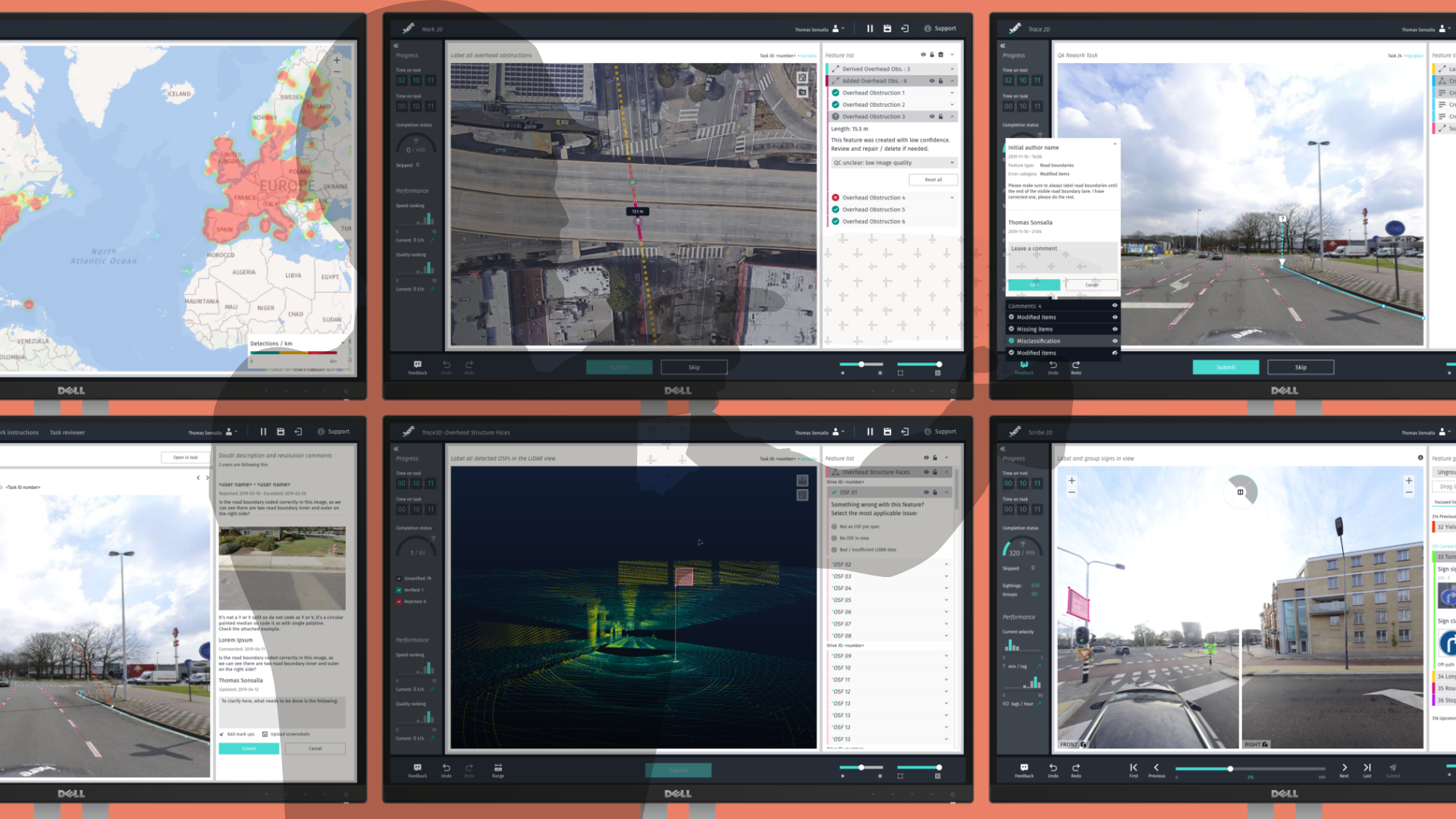
3 months after the initial request we released our first redesigned tool, and thanks to our component-based approach were able to add 3 more just 3 months later.
Everyone in the design team owned the design responsibilities for one ore more tools, while I took additional care in ensuring consistency, stakeholder management, and working with user research.


As we moved at a growing pace little cracks started to appear: sometimes the designs were not aligned on the grid, sometimes the colors were off ever so slightly, and sometimes the same selection flow was solved with different UX patterns.
This is quite normal when working on multiple iterations with a team that operates across the globe, but it can spin out of control quite quickly.
To help solve this issue, I dedicated 2 weeks to transform the specs and components we had into a proper design system.
It was built in Adobe XD and included everything from high level principles, information architecture, style guide information, down to components from atomic to template level (with component states where appropriate).


It’s 2020 now (at the time of writing), and we’ve been using and iterating our design for almost two years, learning a lot along the way. While I tried to prevent it as much as possible, there were elements and interactions here and there that had to be somewhat shoehorned into the existing system - workable, but far from ideal.
The beginning of this year opened the opportunity of refreshing our tooling design, both from the UX and the UI perspective.
While keeping the modularity of a component-based approach in the design, I reworked the layout and IA of our tools, updated the color scheme to match the current company style, and put an emphasis on integrating support functionalities closer into the tools - something that wasn’t possible in the previous versions.
A small snippet of this work can be seen in the prototype below.
Made with Adobe XD. Embed not working? Try it out here.
6
Reflection
The good, the bad, the ugly
I look back fondly on the time spent on this project. Sure, the user interfaces we’ve created didn’t look super slick, and the designs were not always implemented 100% (or even 60%) to spec. But we had successes right from the start: we improved the user’s quality of life with a better user experience, we managed to reduce onboarding time due to simpler workflows, we eventually decreased development time, and we created a great rapport with stakeholders.
Personally, I gained a lot of experience managing a design project of that magnitude (creating concepts and producing specifications while simultaneously leading a team without being their manager) and working in such a culturally and professionally diverse setup.
