
2019 - 2020 • System creator and curator
Design system for tooling software
“HOW I tackled the increased demand for mapping tools and the consequential inconsistency creep with the introduction of a component based design system for design and development.”
Case study content:
The problem space
Research and focus
Construction
Reflection
After some early success stories with designing and shipping tools for HERE’s internal map production, more product managers approached me to ask for my design team’s support.
While very flattering and rewarding to see a desire for a user centered approach for the usually neglected topic of internally used software, I also realized that my ways of working and producing design artifacts had to drastically change if I wanted to deliver quality output and not lose my head in the process.
1
The problem space
Some background info up ahead

To make users feel “right at home” when they switch between products of the same family, the user experience and software must behave in the same way and make use of the same patterns, the same feedback, the same presentation. For example, using different ways to save progress (autosave vs. manual) can be more than a mild annoyance, it can have severe consequences for the end user.
Nevertheless, building and maintaining consistency across products in design teams larger than one is not an easy task (it’s actually pretty difficult when you’re working on your own already). In my situation, the team wasn’t even fully present in one location, but separated by 12 1/2 hours worth of timezones.

With the distance and split of responsibilities (every team member was often working independently on one or more tools), communication and check-ins became more of a comparison and review session than ideating and collaboration.
Still, we found it near impossible to scrutinize every design spec AND deliver them to the waiting development team in time, which lead to increasing inconsistencies creeping. Besides, once “in code”, it was hard to get them updated.

Then again, this problem and situation is not a novel one; every creative team that works on complex, multi-product solutions has to deal with maintaining consistency and making the design process more automatically aligned.
Of course I’m talking about style guides and, more digital aged, design systems. With some time to spare during the holidays, I went on to research what a design system contains, and made a list of my own of what should be in ours.
2
research and focus
Defining structure, style, and content

I started my work by looking at some of the most praised design systems out there. I compared their content, structure, and approach to derive some sort of blueprint for my own needs.
This work helped me tremendously in getting a better understanding of the subject matter, and more confident in constructing a design system for my own and my team’s needs.

The design systems I analyzed during my research phase include:
• Material design
• Fluent Design System
• Atlassian Design
• Apple Human interface guidelines
• IBM Design Language
• Lightning Design System
• Polaris
• Photon

The results of my research led me to rearrange the content on a hierarchical level, starting at the foundation with principles and information architecture. This influenced the user experience level patterns and HCI guidelines, which then were used to define and realize the user interface level’s themes, colors, and design components.
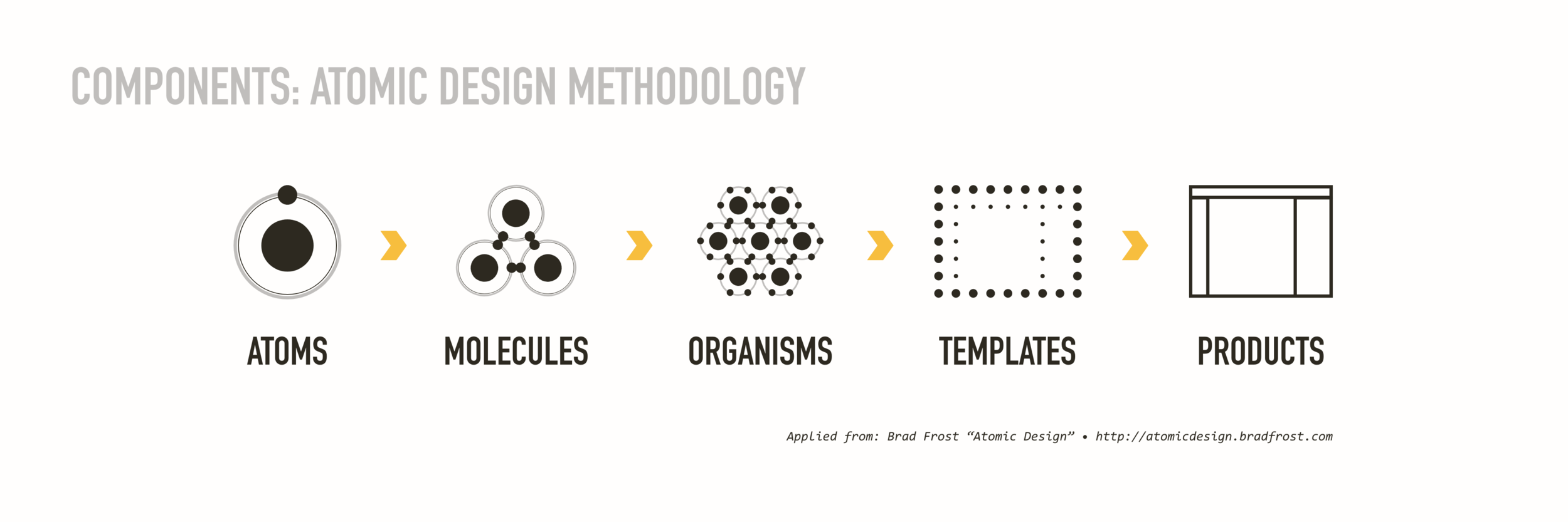
The design of the component was following Brad Frost’s quasi-default Atomic Design principles, which allowed for a very methodical and developer friendly approach to design (and review) parts of the UI, from atomic to product dimension.
With my research on established systems done and an extracted path and structure setup, it was time to design a design system of my own.
Logically the first step would be a breakdown of the current tools, flows, and artifacts we had designed so far and put them into this new structure. But, as designers do, I had to start with a title and icon first:

3
construction
Deep dive into the what & how

Following the learnings from previous research, I wanted the Toolbox design system to be more than a digital style guide. It needed to include more than guidance on the surface level; I wanted to use this opportunity to document and communicate
the design reasoning behind the products we were shipping. Therefore, the content of the toolbox starts with 3 key principles (see above), before diving deeper and getting more granular with every section.

As shown above, I was keen on providing as much guidance as possible by combining user experience-, usability-, and user interface in an easy-to-follow narrative for the invested audience.
Some examples of what I included in the Toolbox Design System are shown below.


The total time I spent on creating the first version of the Toolbox was about 2 weeks, including research and reviews with my design team. It was also the first time using Adobe XD and testing out its component functionality, which at the time was a bit limited compared to Sketch.
In fact, I had to redo the component part of Toolbox from scratch once it introduced component states. Either way, having an actual project is the best way to get familiar with a new software.
4
Reflection
The good, the bad, the ugly
I did learn a great deal about what makes a design system useful and usable, both for designers and their workflow, as well as for developers. The research was a great starting point of course, but even more so, having my team test it and developers providing feedback on how they would consume and adapt this component based approach into their own process.
The biggest win in terms of productivity for the team was that with an established set of components we were no longer required to specify every little detail for every single tool we designed. A great help here was the ability to share XD files directly or via HTML export, even eliminating the need to redline any part of the UI.

Using the design system and its components also virtually eliminated all inconsistencies we had across our design documents, which in return reduced the time we spent discussing misalignments and helped us focus on what’s most important - a great user experience.
As for takeaways to improve upon: I wish I had started the tooling process with a design system in mind from the very beginning, as retroactively adjusting components required some changes in the UI and UX, and additional needs for engineering - work that didn’t fully make the cut for already developed tools.