
2018 - 2019 • LEAD PRODUCT DESIGNER
MAP DATA Collection and fleet management
“HOW A WATER COOLER CHAT LED ME to design A DATA DRIVEN RE-ORCHESTRATION OF THE COMPANY’S MAP DATA COLLECTION PROCESSES, To (SPOILER ALERT) some sort of success.”
Case study content:
Discovery research
Solution strategy
Definition and design
Results and iteration
Reflection
During my time at at HERE Technologies I went through many problem spaces: I started out in the commercial realm designing consumer map products, went through an exploratory phase on an innovation team, and worked on Enterprise products using location data. All had one thing in common: they were using HERE’s proprietary location data. Which itself had to be generated somehow.
I am a naturally curious person who likes to understand relevant issues as detailed as possible. So, when the opportunity came about to support an internal engineering team with a redesign of their process to collect location data and monitor that progress, I was all in. Luckily, so was my manager, who appointed me as lead UX/UI designer for this project.
1
The problem space
Some background info up ahead

The concept behind map data collection itself is fairly simple: making sure that real world street data gets picked up in recurring intervals to ensure HERE’s map data is up to date.
The execution of this end-to-end data collection orchestration, however, required understanding of the complex pipeline that involved a lot of stakeholders and software applications.
The latter we found in dire need of a redesign.
This was far more than a visual overhaul, as one is often asked to do, but an ask for fundamental changes both on front- and backend. Output needed to be increased, and time, management, and long-term engineering efforts decreased significantly; crucial if global saturation is the end goal.

I learned about this endeavor to improve the current ways of working in one of the most clichéd ways possible: by having a water cooler chat with a program manager. He told me that he tried to get this effort rolling for a long time, but was lacking the resources to convince upper management with a clear vision and concepts. As mentioned before, I was curious about looking at the inner workings of my company, so I agreed to support him and his program.
Sometimes, projects just get started like that.

2
Discovery research
Pain points and root causes

In order to understand what needed to be designed, I had to learn more about the space I was designing in: who were the key stakeholders and what goals did they pursue? What was the process and its pain points?
Also, what does the data look like in terms of information we could extrapolate and turn into actionable user experiences?
It was time for some research and investigation.

The revelation that most business goals revolved around getting more done for less money was not really that surprising; however, involving executive stakeholders from the beginning was very fruitful and created a positive, collaborative atmosphere.

Talking to the audience, i.e. the main and peripheral user groups yielded more concrete needs and pain points that helped inform both direction and priorities - the more people need a particular thing, the more relevant it seems to be.

From interview sessions with users and by looking at existing documentation it was pretty clear that the bleak picture painted by the program manager was more than accurate: something had to change, urgently.

If solutions seem so obvious, then someone else must have thought of them before. And if that’s the case and nothing has changed, then it’s important to figure out what roadblocks were in the way that prevented improvements before, as they will likely be in the way this time around as well.
This discovery phase unearthed a lot of valuable information: I learned about important stakeholders that needed to be kept happy and informed, found out about relevant jobs to be done, got a good grip on understanding the underbelly that is the backend pipeline, and became aware of previous failure and the reasons for those.
With this amount of information I felt confident enough to move forward, even though there was a lot of ambiguity left that had to be extinguished throughout the design process.
Discussing these findings with the program manager, we distilled a key ideation focus that would guide us through the next steps:

3
Solution strategy
Deep dive into the what & how

With the understanding what was wrong and what was desired, the questions turned from “what” and “why” into “how”. For this, more deep dives were required, as well as further support. A colleague joined my efforts in a 50% capacity, which helped expedite the next steps of the journey dramatically.
Together we conducted more in-depth interviews with key stakeholders, analyzed existing tools, observed the collection process on the road, and organized design focused workshops with an interdisciplinary group of managers, engineers, and us designers.

We took the raw data of these deep dive sessions and filtered and sorted them from a point of view of increasing efficiency through automation.
Doing this allowed us to keep our explorations across different sections of the collection process aligned - and stopped us from veering off the path more than once.

Looking at various charts and the manual effort that went into creating, maintaining, and sharing schedules and updates, it became apparent that automating this part would save an enormous amount of time and reduce human error.

Analysis of the process journeys (a variation of a user journey focused on the states and stations data goes through) revealed more redundancy and opportunities to automate, or at least rethink the process.

You can’t design a frontend that heavily relies on backend processes without understanding what’s going on behind the scenes. In this case we were able to not only observe, but influence the re-architecture of the collection backend by providing user insights and UX/UI needs; this helped create a stronger harmony between both realms of the product.

Definition and design
Guidelines, flows, UX, UI
4


As the picture of what needed to be designed and how design and development would approach it became clearer, so did our understanding of unresolved issues. At the time of this discovery, the whole team was pretty optimistic that most if not all of those uncertainties could be resolved within the given timeframe - it only required collaboration with other teams, who we depended on.
What wasn’t impacted as much was the design process, so I continued boiling down the information my colleague and I gathered and started work on the actual user interface.

The first key job this new product needed to do is let users setup requests for data collection, from area to data type and recurrence.

The second key job was to allow users to monitor the progress. As map data collection is very much location-based information, we wanted users to see the data being collected and processed right on the road, and then further break it down in data visualizations.

Similarly to following the data being processed, it was important to monitor the collection fleet and monitor them remotely.


Throughout the design of those charts it was important to me that users would associate colors used for certain steps of the journey, so I created a color scheme that matched that requirement. Unfortunately, my ignorance of the quality of screens of our users as well as accessibility for color blindness, resulted in a sub par experience for many.
I only learned about this after the first release (no user test gave any hints for this issue). Once understood I rushed to fix the issue by creating a new color set that I tested against various screen types and accessibility parameters.

The ambiguity prevented us from finding a definitive set of data we could display. Instead of waiting I designed the UI using a grid system and components that could easily be interchanged if need be.
Design and frontend engineering moved forward in this ambiguous environment, creating components and workflows.
However, the same could not be said about resolving many of the roadblocks we faced.
5
Results and iterations
After release is before release

Time went on, but development came to a crawl: the more the backend team investigated, the more issues were discovered. As we couldn’t provide stakeholders with tangible results, we started to notice increasing apathy towards the project; and on the horizon lurked the pressure from leadership to deliver.
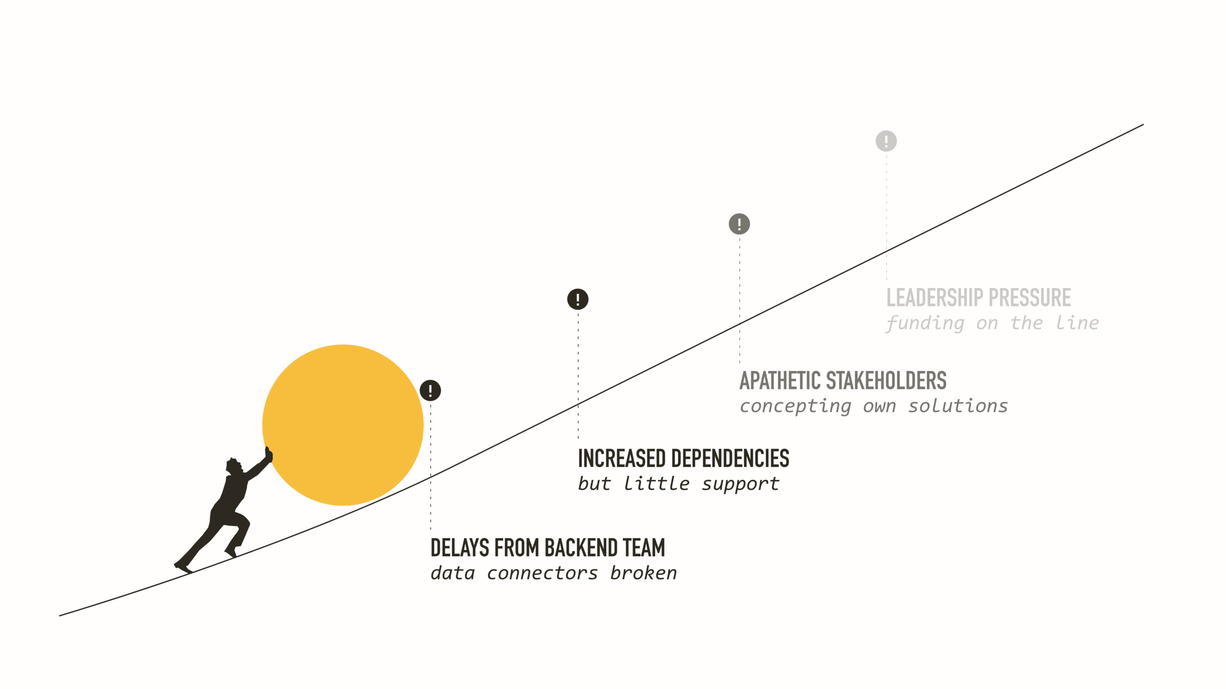

In a dramatic turn of events the team decided to pivot hard towards releasing what we had control over. Within 3 sprints / 6 weeks we changed the design and worked with engineering to release an MVP that focused on fleet monitoring and a simple view on available data.
The more sophisticated and automated solutions would have to wait a little bit longer. Below is a clickthrough prototype of what was built:
Made with Adobe XD. Embed not working? Try it out here.
6
Reflection
The good, the bad, the ugly
So, what came out of this? It really depends on how you look at it: on the one hand we were not able to fully realize what we set out to do, which was disappointing. On the other hand, we did manage to bring groups of people together, delivered a solid foundation to build upon with future releases, and helped updating the data collection pipeline at least in parts. It also allowed for some moments of professional growth by working through a problem end-to-end, from vision to release.
Still, I think most importantly, the project did continue after release thanks to an overwhelmingly positive response (minus the color issue of course).
