
2020 - current • Lead PRODUCT DESIGN • VISION ARCHITECTURE • CONTENT Strategy
REdesigning an app marketplace
“How I redesigned a space for products from vision to backend tools through Product design thinking and growing strategic partnerships across multiple business verticals.”
Case study content:
Problem space
Discovery research
Solution strategy
Definition and design
Results and iteration
Reflection
In the summer of 2020 I started a new position as Principal Product Designer at RingCentral and became part of the Platform & Integration team. My first large scale project was to work on redefining and redesigning the way we let our customers and our customers’ customers access app integrations for and from RingCentral.
But what was introduced as a straight-forward and frontend-focused job, turned out to be an exercise in content strategy, stakeholder management and scope staking.
1
The problem space
Some background info up ahead

The RingCentral App Gallery is the main destination for customers to find and install a) app integrations for RingCentral products, and b) RingCentral extensions for 3rd party products. This provides them with more functionality in RingCentral and extends the benefit of being a paying customer into other products, such as Outlook or Salesforce.
It is also an attractive platform for small to large developers/publishers to advertise their services via integrations that work seamlessly and intelligently with the ecosystem of RingCentral customers, thus giving them the chance to convert some.
Both of which are excellent reasons for RingCentral to invest into keeping the app marketplace fresh, well-crafted and delightful to use. Not only does it increase the perceived value for customers, it also allows for partnerships with external developers.
Last but not least, using integrations to build out a use case portfolio instead of developing every feature in-house (esp. some that don’t match the company’s principle value proposition) is just economically smart.


Over the last couple years however, the company’s focus had to shift, and 2020 in particular pushed RingCentral to invest more into solving remote work use cases with messaging and video call products.
This led to a first attempt of an App Gallery that could not fulfill the ambitions of its stakeholders and the expectations of its users. What exactly went awry and how I would be able to improve it was my first task to solve in this redesign puzzle.
2
Discovery research
Pain points and root causes

I was lucky enough to be onboarding at the same time as this project rolled along, which allowed to spend some additional time in discovery research ( I had to get familiar with the company’s and my team’s way of working anyway, so a somewhat slowed delivery was expected).
For this project I went with a 360˚ research approach, looking at the problem space from all angles and inside and out.
This work included:
interviews with end users, developers, internal stakeholders to learn what’s desired and not working
a competitive analysis and a heuristic evaluation to see what’s wrong on the UX side and how to make it better
mapping out dependencies and processes to know who needs to be on board internally to make this a success story

The implementation I found was functional, but very static and underdeveloped. Neither experience, presentation nor content showed any signs of work beyond MVP.
In addition, the two versions of the App Gallery (web and app) had two very different approaches and content to offer, even though they were connected. For example, the app version redirect always to the web if a user was interested in detailed info.
Analyzing the core user journey exposed significant disruptions in its flow and solutions that felt like “band aid” rather than “thought-through”.

During my customer analysis it became clear that an app marketplace needs to cater to many different types of users, not only the person that ends up installing an integration.

Looking at direct and indirect competitors, e.g. other app integration marketplaces and app marketplaces in general allowed me not only to get a better understanding of the underlying use and business cases, but also showed me some very elegant solutions or strategic approaches, which we could include in our own solution.

Talking to internal stakeholders quickly showed a shared need to transform the currently static App Gallery into a profitable marketplace.
We had no intention to take the 4th step before the first, but this notion of profitability remained with us when I worked with the PM on the vision and direction for the new App Gallery.

Finally, and arguable most challenging: stakeholder management. The App Gallery is a product that touches upon many different businesses within RingCentral. This is great as it allowed me to learn a lot about the company’s inner working and get a set of subject matter expert more or less on retainer.
I knew that keeping those parties close (but not too close) throughout the design process would determine how smooth or bumpy the road to release would be.
In total I spent about 5 weeks during my onboarding time to gather enough information and ideas that would help the PM and me to put together a deck for executives with the whole purpose of reiterating what’s good about app
marketplaces, where the difference between desire and current implementation lie and which plan we would like to pursue in order to improve the product.
3
Solution strategy
Deep dive into the what & how

With all the qualitative and some quantitative data (accessing Mixpanel and Google Analytics helped us look for potential blocks in clickthrough rates) in our hand, it was time for the PM and me to ideate a solution, and sell that to executives.
Here I worked on a narrative as clear and memorable as possible, with the intention of connecting the high-level vision with the detailed execution the customer would navigate through at the end of the day.

A vision should be in place for every product, especially for larger ones that will take years to fully come to fruition. Without a clear desire and direction, there is nothing to vet ideas and solutions against anymore.

While a vision is often a very soft statement that leaves room for interpretation, a set of missions help articulate them over a period of time.
In this case I used the metaphor of growing crop to illustrate that we need a solid foundation if we want to reap any benefits sometime down the road.
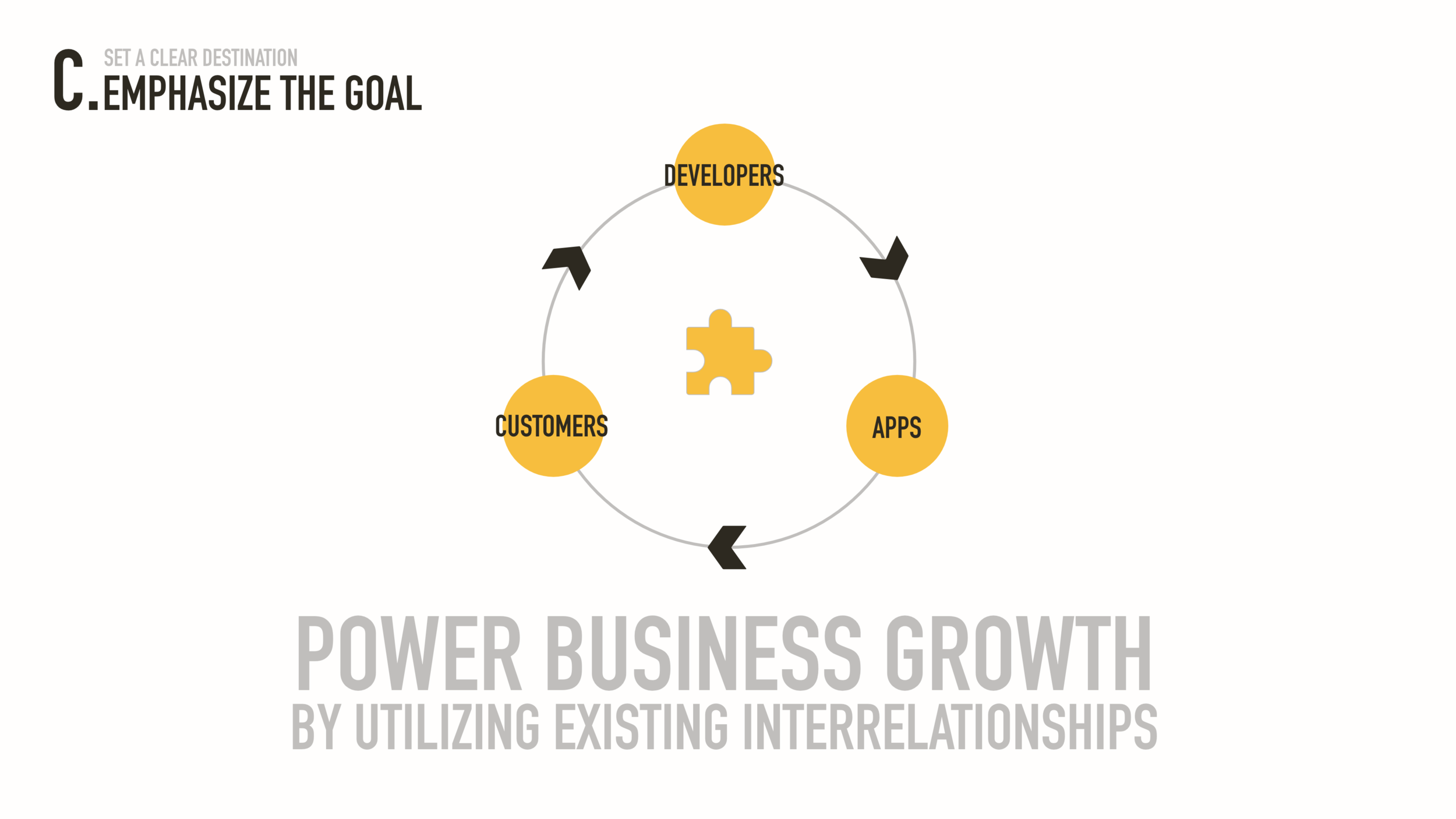
Of course, there’s no point in heading out without a destination. We kept this one high level and simple, as in our mind it really is – it’s the execution that’s complex.

With the vision and mission set and a clear goal in mind, I worked on setting up some core experience principles to guide my own and my team colleagues’ design work.
Similar to setting requirements and features, the design followed those strictly and review every spec against those principles.

For many this goes without saying: there is always more work to be done than what the initial requirement asked for.
It was part of my job to uncover those additional tasks and work with PM and other stakeholders ahead of time to ensure they get addressed before they turn into bottlenecks and other severe issues.
Definition and design
Guidelines, flows, UX, UI
4

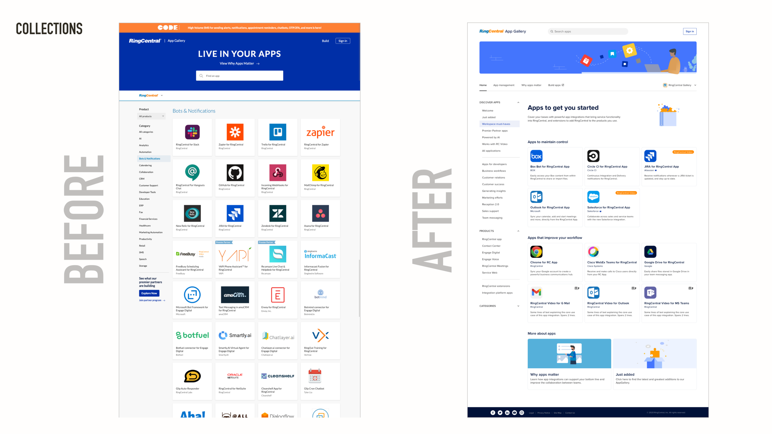
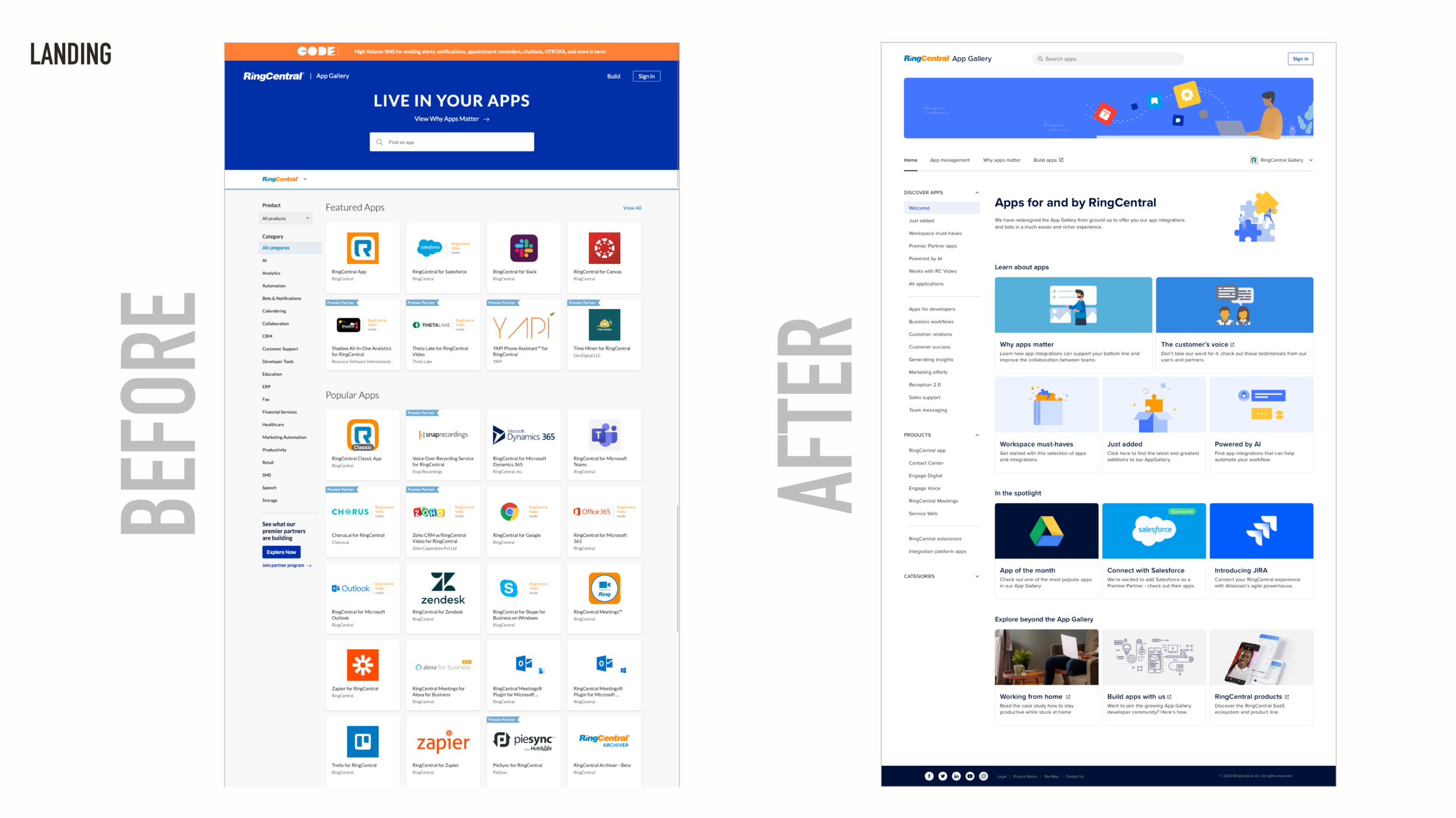
The Design process for the first couple weeks and months went smoothly. It was decided to start the redesign on the app version first and then have a follow up project to update the web App Gallery afterwards, using the learnings and design artifacts as a baseline. I have created flows and specifications using best practices and existing patterns to guarantee that this new feature is a natural extension of the RingCentral app, and not tacked on.
However, as it often goes, priorities shifted and development teams were put on other tasks. This required me to quickly shift gears and ramp up the design process for the web version instead. This came with its own set of challenges and additional stakeholders from brand and marketing, but no additional time – we had to make the release by end of December. Here’s an overview of what I have produced in the time given.
Following the defined core user journey, I had to make sure that all paths eventually end up at an app profile page, from which they’d be able to install an app (or visit another marketplace to do in some cases).
The modular base layout had to support both a “browsing” experience as well as a look and feel that stands back and lifts up the content, which is the main reason visitors are coming to the App Gallery.
The content itself, from what’s on a card to what is shown on an app profile, was structured in a way that allowed to consume information in a natural flow from most critical to secondary level. Every detail that was added had to be checked and tested for simplicity and clarity.


The fixed navigation and flexible content grid follows best practices that helps visitors find their way and experience pages that look different enough from one another, both of which helps getting around without getting lost.

As a website can be accessed from most any type of device and screen, I needed to make sure that there are multiple breakpoints in the App Gallery’s responsive behavior and transition from desktop to mobile view.
During the design phase I had to make decisions not only on structural level, but also on details such as the types and makeup of specific content blocks and the behavior of the main call to action (CTA).
The latter proved to be a very finicky task, as there were many variables that had be taken into account, from user status and rights to type of content, all of which determining the micro copy and resolution after a click.


The biggest and most invisible challenge however came with the processes that happen “behind the curtain”. The content a visitor sees needs to be produced: pages need to be created and filled with copy and images, apps need to be vetted and published. The solution used so far relied heavily on development efforts – costly and inefficient. We had the desire to give more power to the people who are editing the content - the company admins.
However, it was not possible to hook up an established content management system software to the new App Gallery. Instead I had to work on one myself or improve the existing flows and tools. Everything happened in a very “agile” fashion with minimal spec work, and with plenty of “on-the-fly design” with PM and engineering, and doing ad-hoc user testing with the colleagues who would be using it.
This way of working allowed me to deliver both frontend and backend solutions without clocking in (too much) overtime.
On a similar note, much of the content had to be reproduced. The new app cards for example required a different (standard) form factor for app icons. Over the course of a week I updated all 250+ icons and set up some guidelines for future needs.
Finally, I spent a lot of time with the editor team, marketing research and our copy writers to work on the categories we want to show in our secondary navigation. We were clear on wanting to make them use-case driven, but needed to figure out which ones were relevant to our customers and which ones we can actually support with available integrations.
All in all this was a very important part of the overall process that warrants its own case study at some point. For now, here are a couple high level illustrations to provide a glimpse of the work that I put together.


5
Results and iterations
After release is before release

The new App Gallery for web launched in December 2020, after approx. 5 months worth of work from research to release.
You can click on the link above to check out the latest iteration, live on the web.


After launch we set our sights on two new targets: data tracking and updating the app version. On the data front we noticed two important aspects: the production of pages and content editorial was very much welcomed by the admin team, and they have been using the tools we provided very frequently, adding and editing content on a bi-weekly basis, and making quick changes on the fly.
We didn’t notice much of an impact on the clickthrough rate though. While it’s positive that the redesign did not lower any numbers, they were not significantly higher either. There is still plenty to interpret here, but we start to infer that the overall offering and the promotion of the App Gallery itself needs some work as well.
After the initial pivot from app to web during development in 2020, it is also time to revisit the work that has been done so far, but now update it with the learnings gathered from the web. I am currently working on specifying the user experience over multiple phases and releases, with the intention of creating a well-integrated space for app integrations.

Our biggest impact so far has been with the internal processes, but not so much with the visits and installs. We are analyzing the incoming data to figure out how we can address this situation.

One of the remaining pain points I am planning to address is the terminology and classification of content types. We heard user feedback that it’s a bit unclear if an app it an add-in or an extension. It’s a complex topic that will require multiple solutions across the whole App Gallery.

As said, now that the web has been released, I can finally pay full attention to also transform the app version from a static grid of apps into a rich browsing experience.
6
Reflection
The good, the bad, the ugly
This has been a very interesting and satisfying project to work on. The many different stakeholders, users, requirements and interrelationships between business and design added a delightful amount complexity to every decision I had to make (and review). The addition of a whole set of backend tools and processes that needed to mapped out and against the frontend allowed me to really work on the problem space from all angles.
With the foundation put in place and being tested right now, I am looking forward to dive more into the analytics side of things and to drive more visitors to install integrations.
This is an aspect I had to put aside for the first release in order to get it out the door in time. Not ideal, but you have to set priorities and follow them ruthlessly if you want to get anything done.
Improving our numbers is another beast of a task that will require close collaboration with marketing, brand, copy writing and business partnerships. But it is also essential in order to proceed to the next mission towards building a profitable marketplace.