
Navigation for data collection
2016 – 2020
Design and shipping of two in-car navigations apps to support map data collection and system monitoring on the road.
IN-Car navigation apps
Design Lead UX & Research
I The challenge
Designing in-car navigation experiences is delicate: aspects like the relation of driver - device, the layout of the screen, and the content and timing of its presentation can have huge impacts on the user experience, ranging from taking a wrong turn to being involved in an accident.
It’s also an interesting field to work in with many chances to grow design expertise, so when I was asked to work on redesigning an existing driver application for HERE’s internal data collection fleet, saying “yes” was a no-brainer.
Having a fleet of drivers on the road that collects location information is a crucial part of the end-to-end map data creation process. I go more into this over here, but in principle, the fleet’s mission is to collect location data (street level imagery, LiDAR, GPS) in requested areas - be it because the data needs to be updated or because there’s new development not yet available in the map product.
While managers and fleet support sit in their offices to plan and orchestrate, drivers are alone on the road, often for days or weeks. Clear navigation from start to finish and a reliable user interface are a must, as is providing them with means to resolve any issues they might face along the route.
II The journey
We started the project by conducting interviews and observation studies with seasoned and new drivers, as well as their managers and people from the support team. We had to get a clear picture of the day-to-day, the situation in the car and on the road, in order to design an interface that is not only functional, but also focused on the essentials. In addition, having to interact with a device while being on the road is always a safety risk, so we needed to minimize the mental load as much as possible.
Desktop research on guidelines, rules, and best practices helped us validate our design approach, as did talking to design and research colleagues who were actively working in this field for a while.
We ended up working on this topic twice, and designed two very different applications serving the same core problem of navigating a driver safely along streets that need to be scanned by our data collection devices.
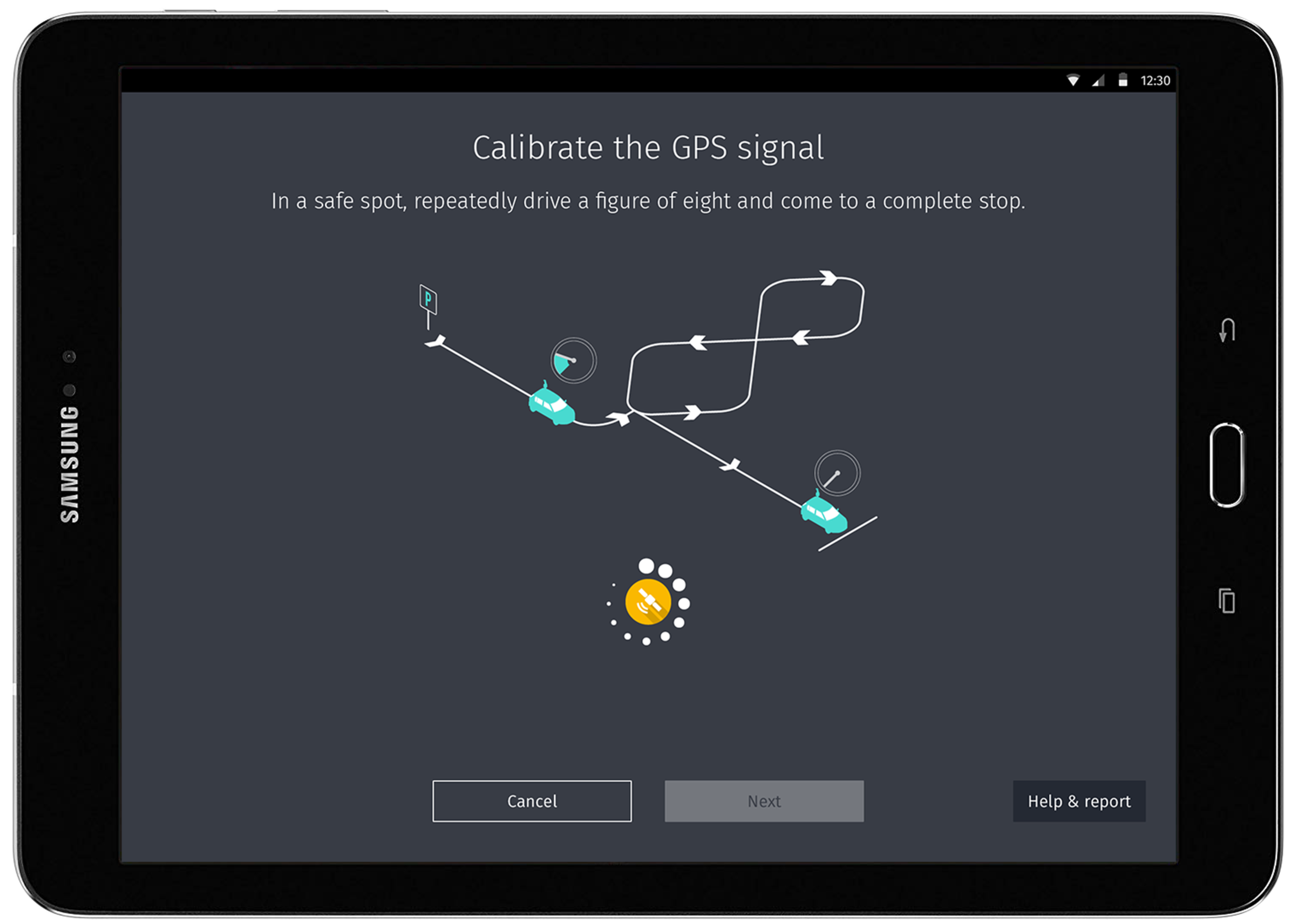
HT CONTROL (2016/17)
Design Lead UX & Research
Design and shipping of an in-car tablet app for map data collection and system monitoring.
The first product we’ve designed was more of a redesign of an existing tablet application. The main functionality of the application featured turn-by-turn navigation to ensure the driver collects the information that was requested. In addition, they were able to monitor the system for any issues that might occur during the day. Those were items that were deemed to be the key jobs the updated application needed to fulfill.
We also added quality of life elements such as a setup phase that visualizes the system checks, as well as additional on-the-road information like a front-cam stream from the collection rig (so drivers could check the image for dirt or fog on the lens).
All these experiences were designed with readability issues in mind that could be caused by the distance between eyes and device.


The result of our work ended up to be a compromise between usability and the perceived need to keep as many features from previous releases as possible. As it's often the case with projects that are not tightly managed, any feature request can make it in without being properly checked for its usefulness. The real estate of a tablet application is also too tempting for adding more and more content, ultimately to the detriment of the user.
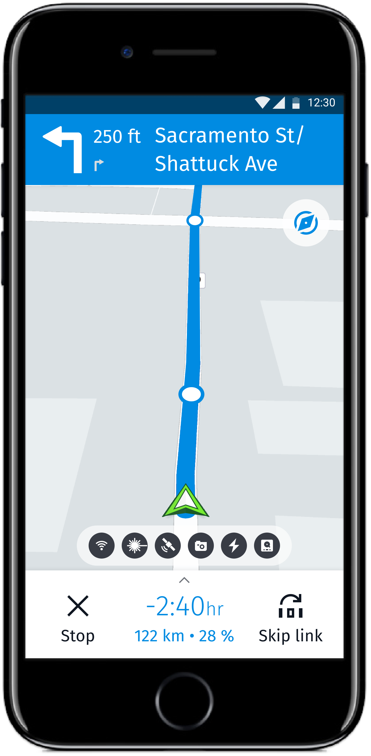
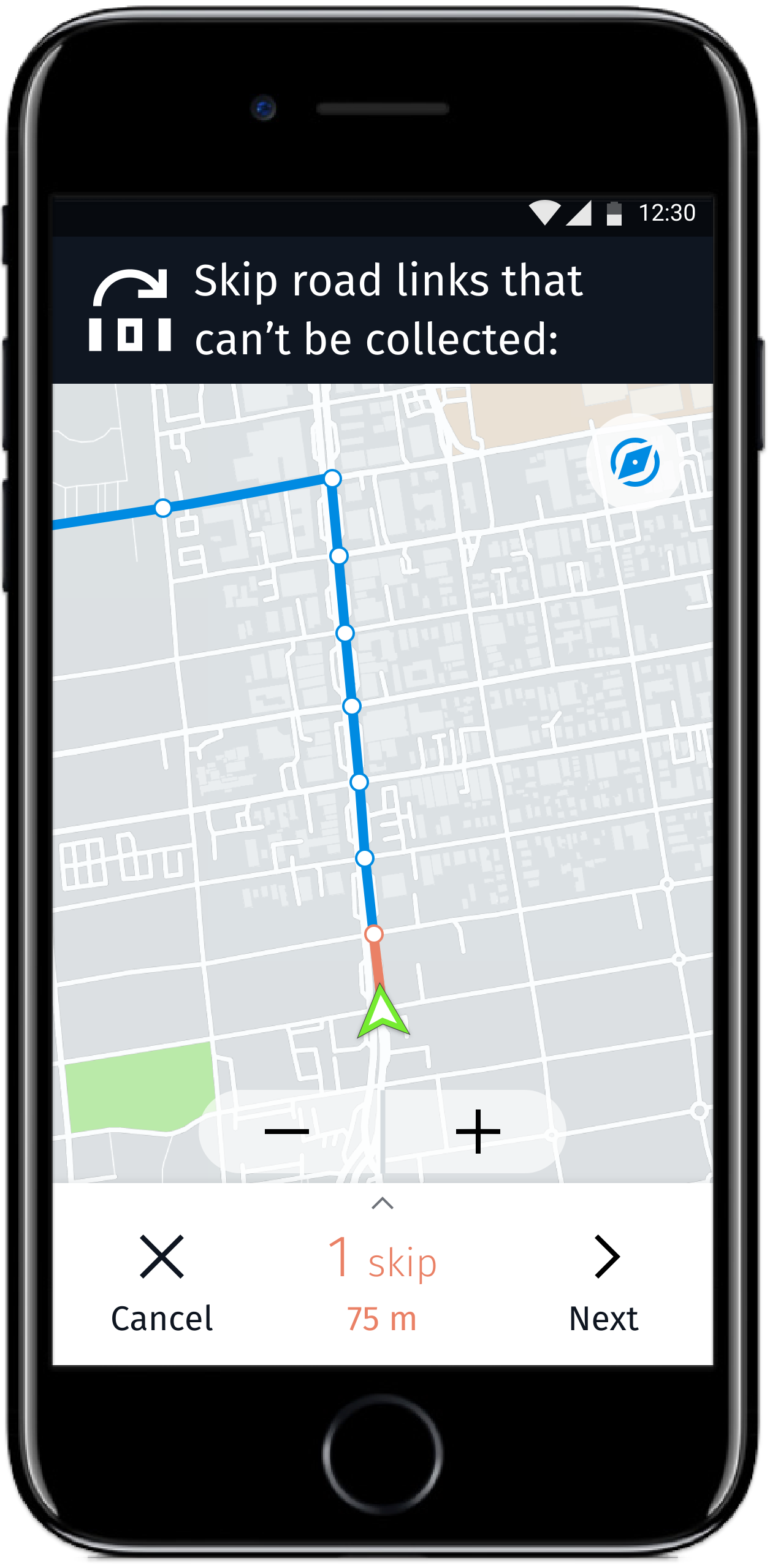
Design and shipping of an easy-to-use, commercial-grade in-car smartphone app for map data collection and system monitoring.
HERE VALENCE
(2020)
Design Lead UX/UI & Research
Some time later, we got a chance for a do-over. As the company strived to democratize the data collection process (read: lower the barrier for people to join as contract drivers) and try out different, lightweight collection techniques, we were asked to take another look at creating an in-car navigation and collection application. This time for mobile devices.
With the switch of form factors from tablet to smartphone, and the switch from well-trained drivers to “anyone can do it”, we knew we had to rethink the complete user experience and deliver a product that’s focused on the core jobs it needs to perform, and that is extra safe to use in traffic.
The change in form factor led us down a path of carving out a clear path from startup to the end of the day (following a revised user journey) and rebuilding the information architecture from scratch. With this, we were finally able to minimize the amount of information and call to actions on any given screen, giving each part of the application a well-defined purpose.
Made with Adobe XD. Embed not working? Try it out here.
The visuals of the user interface took cues from its sister application Nucleus, which is used to monitor the fleet and orchestrate the data collection process (more on this here). Another connection to Nucleus lies in the name of the application itself: Valence.


III The takeaway
HT Control was my first design project for an internal product and a driver application, and it came with many takeaways. I became more aware of the form factor, and the spatial environment of the user (distance to device, light sources, distractions on the road, etc) - similar to designing for a smartwatch, but more complex and with higher stakes involved.
Since the previous versions of the app had not received any design support, it was fairly easy to improve the current situation. Getting engineers and managers to commit development time to improve the UX and UI of an internal tool that “had been running fine so far” was a bigger challenge. As was convincing them to remove functionality that evidentially was not used by anyone (we tested).
At the end of the day, this experience further connected me to the mindset of engineers and higher managers in a company that is still slightly skeptical about following through with their belief that good design is important.
Further down the road, the work on Valence was a much smoother ride with a clear user-focused design approach and established relationships with stakeholders. It provided a much more positive outlook for the whole project.