MAP PRODUCTION TOOLS and services
2018 – 2020
Setup of a design team and design processes dedicated to internal tools and services that support map production, plus design of said tools and services.
A system of internal map buildout tools
Team lead & Design lead UX/UI
I The challenge
My second adventure in the world of company-internal products focused on creating a suite of tools and services for HERE’s internal map buildout production processes.
For this purpose I was given the opportunity to not only put together an intercontinental design team, but also define our ways of working, the rules of engagement with engineering and stakeholders, and to promote the importance of good usability for internal tools even further. A fantastic chance to dive into team management and provide design expertise for an often overlooked part of a company, but also a work area that provided multiple obstacles to overcome.
Parts of the design and engineering teams, as well as our complete user base of 1000+ map data coders, reside in Mumbai, India, while stakeholders and other engineers have their offices in Berkeley and Chicago. This turned out to be quite a hurdle to overcome in terms of communications, logistics, and reviewing work.
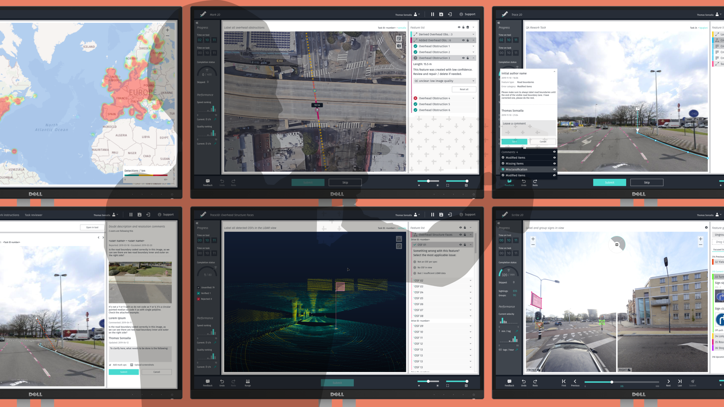
Recreating the world in digital form and keeping it up-to-date is near impossible to achieve with manual labor. But in order to get automation running, detectors that can pick up real world objects like street furniture for digitization need to be built and trained.
Once trained, their output needs to be observed for quality, which is then followed by optimizations to the detector’s ability until it reaches a point of diminishing returns.
All of the steps on the way to automation require manual labor. This means there's need for:
a) people who code parts of the world to create sample data that can teach a detector to "see" objects by reading its shape, color, text, etc. and classify them correctly; and
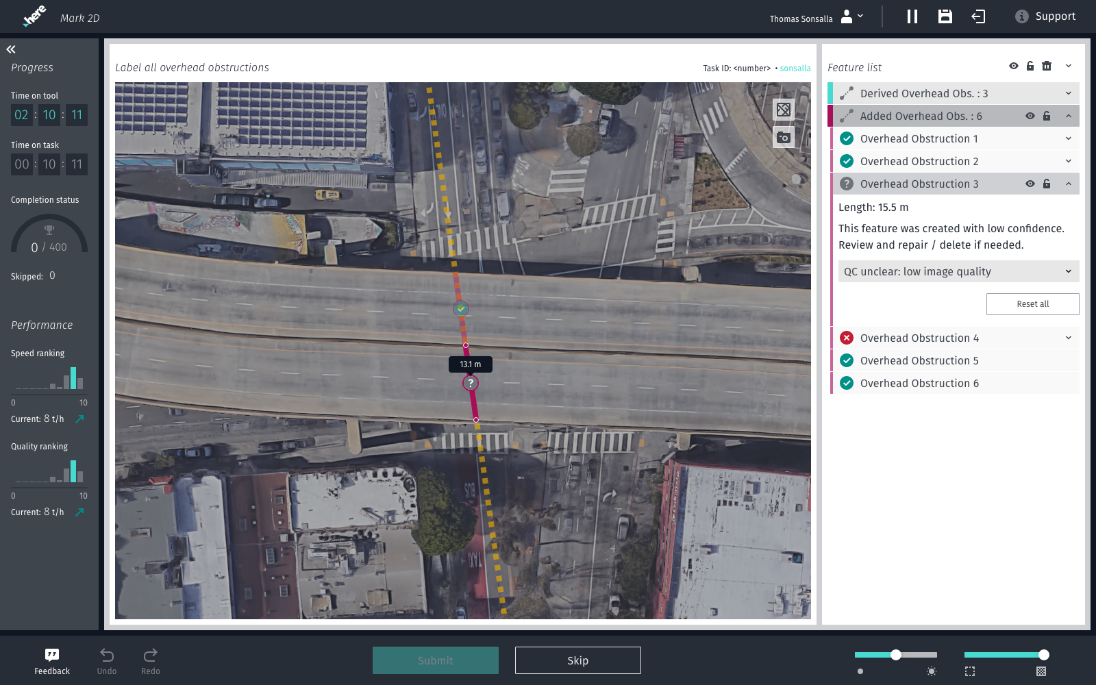
b) people who are working in Quality Control to check the produced output both of coders and detectors.
II The journey
Designing in this field can be as exciting as it can be at times demoralizing. Working close to the so-called “bleeding edge" of R&D means that many paths have yet to be explored and many more problems have yet to be stumbled upon. This makes it attractive for the more puzzle-loving UX designer.
Then again, this “bleeding edge” also often means moving fast through a fog of uncertainty, with a heavy focus on technology and an unfortunate neglect of the user experience. Neglect that usually stems from lack of resources or time to do it justice, and sometimes from ignoring the fact that internal tools are still being used by human beings.
But, no stranger to working with constraints and unknowns, my team and I accepted the challenge and figured out ways to tackle our identified main problems:
unclear requirements
limited development time
changing priorities
broad suite of tooling and service needs
To gather requirements and better understand what we were dealing with, we organized an initial kickoff workshop in Mumbai with relevant stakeholders. Afterwards my design team of 5 set off to analyze the existing tools, workflows, work environments, and internal processes. We reviewed our findings with stakeholders to make sure we were all on the same page.
We established good relationships with everyone involved, from stakeholders to end users, because at the end of the day, a good rapport and trust are essential when working together while being remote. This also led to invitations to more technical workshops and discussions, thus providing insights needed to get the job done.
Painting the big picture and mapping out different relationships (data and people alike) helped us to start our work on providing design expertise for our internal tooling needs - from consultation to redesign.
In terms of tackling the development and the design of so many tools, while still being able to maintain the support and some coherence within the suite, it was important to abstract the set of requirements to find the common threads and high level use cases underlying them all.
Not only did this lead to establishing design patterns and keeping the UX and UI consistent (important for users that switch between tools), it also made the design team operate faster, as we were able to hit the ground running for most projects we were tasked to design for.
After setting up our principles and getting to an agreement with our stakeholders, moving from request to final design became much easier, faster, and clearer.
With development thinking of building the required tools with reusable components, it was only logical for us in design to follow a similar approach: we needed to prepare a design system for our internal tooling needs. So I did just that (more on it here).
While the design system took care of how we design the tools and allowed for better collaboration, it would not suffice as a substitute for UX and UI specifications. Each element, especially the more generally applicable experiences, had to be defined and documented, the amount of detail depending on how specific a solution needed to be and how common applied design patterns were.
Visually speaking we knew right away that there was no need or time to go “all out”, as this would be the first thing on the chopping board come MVP-time. The benefit and ultimate downfall of internal applications is that people HAVE to use them; there's no need for any marketing or eye-catching visuals or animations.
Instead of bemoaning the lack of visual finesse, we focused on designing functional, modular user interfaces with an emphasis on improving productivity and good usability.
It being an internal application that may only be used for 6 months until the process is revised again doesn’t justify making users suffer through bad UX. And while it may hurt the designer’s eye when a button is misaligned, it will cost the company millions of dollars if the button is inaccessible in the first place.


In addition to our tool design efforts, we also took it upon ourselves to improve services that focused on managing the distribution of tasks and assignment of the workforce. It seemed like a natural extension, the other side of the coin so to say, to look into the usability of the services that support the workforce who use the tools we designed.
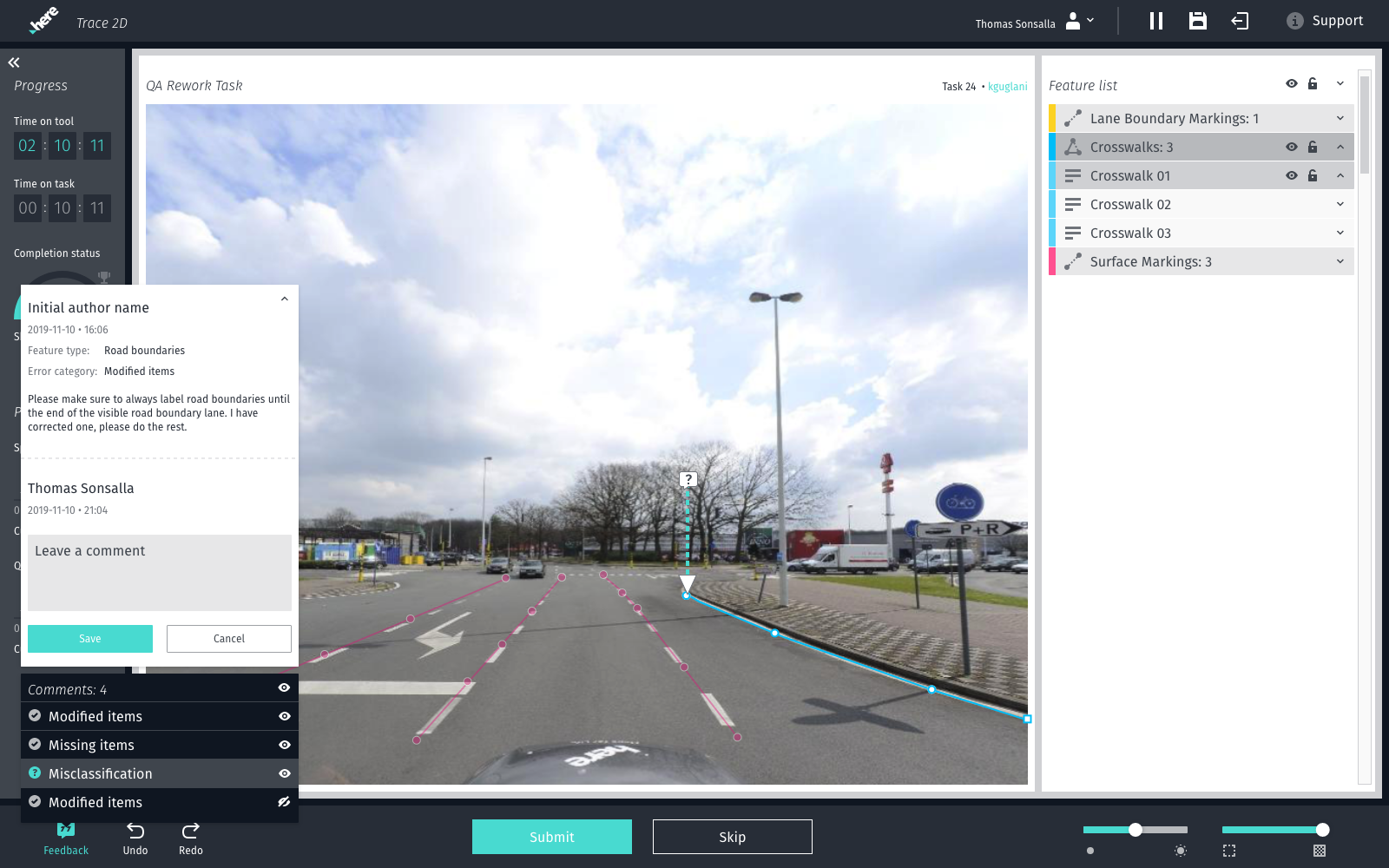
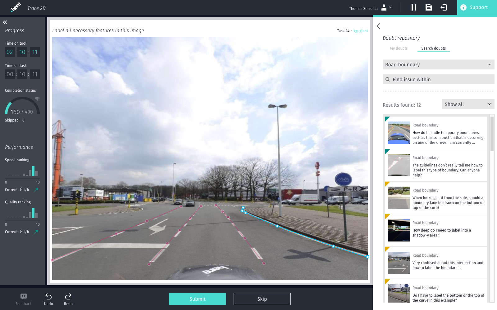
Under the umbrella of a service we labeled “Companion”, we introduced features such as quick access to guides and instructions (interconnected and searchable), methods to send feedback, or request help from more tenured co-workers - both from within the tools and as a standalone experience.
Our goal was to minimize the time spent on using the current alternatives of spreadsheets, internal blogs, or email when trying to solve a problem or get help from experts, and to stop spreading information across multiple platforms in an undiscoverable manner.


III The takeaway
Over the course of two years my team and I designed, tested, and published 15+ new or redesigned tools and services. Some were used to label street furniture and lane markings on street level imagery or in a 3D LiDAR point cloud, others to review detections of said objects and to check for accuracy and correct classification. A few had the sole purpose of visualizing data sets or organizing the workforce.
This project taught me a lot of things. I got to see behind the curtain of a large data production company and was able to improve the quality and efficiency of our processes while also providing users with a better experience for their day-to-day. The work my team and I did had demonstrable impact on the quality and throughput of the company’s map production process, and made sure that contractual obligations with customers could be reached on time.
I learned how to lead and run a design team across a 12 1/2 hour time difference, making sure stakeholders, developers, and team members were not blocked by anything.
On top of this, I got to experience some healthy cultural exchanges thanks to spending time in Mumbai and working with Indian colleagues. All things considered, this might have had the most impact on me, personally.