
Location and navigation services
2013 – 2015
I The challenge
During my time at NOKIA, later HERE Technologies, I was involved in the design of multiple map applications.
Unsurprisingly, a lot of my work revolved around the topic of location and navigation, answering questions about
the space someone is occupying;
the space they want to transition to; and
the means to do all that.
Location based services are often considered utilitarian in nature. They don't take center stage in the user's journey, but have to reliably support the user in reaching their goal.
Still, the spatial and temporal awareness patterns and graphs required to provide users with meaningful information are complex; sometimes too broad, sometimes too limited, but always full of untapped potential. This makes designing in that field an interesting and rewarding experience.
The first application I designed was an HTML5 mobile web app back in 2012, followed by a tablet version, and later native smartphone and smartwatch apps.
While the main beats were pretty similar across them all (find a place, save a place, go to place), each of them provided me with challenges and opportunities to learn and grow.
This was often due to the need to establish new and adapt common UX concepts in the realm of location and navigation.
The following showcases are here to illustrate this.
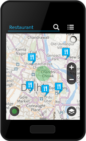
Design and shipping of a map + navigation app for the low-end smartphone Nokia ASHA; from sketches to pre-installed product in 4 months.
ASHA MAPS (2013)
Lead design UX and UI
II-I The journey
My first project as design lead for both UX and UI couldn't have been a better example to test the claim "creativity comes from restrictions". Shipping a map application for a low-end smartphone for emerging markets in 2013 with a screen size of 240x320 px, a 312 MHz ARMv6 CPU, and 128 MB of RAM, required a lot of rethinking and "porting" of common usability. Especially after years of exposure to iPhones and Android devices.
The real challenge, besides working with dev kits and having only 4 months until release, came from the deliberate omission of a feature crucial to every navigation app: the Nokia ASHA was to be shipped without a compass or GPS tracker.
That being said, having this set of problems to solve was wonderfully motivating and evoked a feeling of charting new territories. Working with an ambitious project manager and a group of dedicated engineers made it easier to overcome each hurdle, day after day.


II-II Takeaway
At the end of this tour-de-force, we shipped an application that included all the main capabilities of a map app short of providing turn-by-turn navigation (it did feature a list of directions though).
On the UX/UI side, it amalgamated HERE and Nokia ASHA design principles, e.g. information architecture and app navigation, to create an app that feels as native to the OS as possible.
After this project wrapped up and I moved on to another project, I continued to support a design team working on a public transportation app for the same device, providing guidance and reviewing their work.
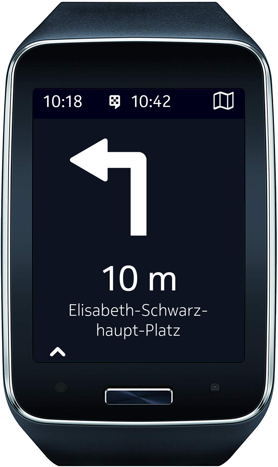
Design and shipping of a turn-by-turn navigation app for the Samsung Gear S smart watch; from brief to release in 3 1/2 months.
HERE FOR SAMSUNG GEAR S (2014)
Lead design UX
III-I The journey
In the project following ASHA Maps, I took on the role as the lead UX and got to work with a few talented visual designers.
The previous project confronted me with a lot of restrictions, but this one provided even more drastic changes: designing a multi-model (walk + public transport), turn-by-turn navigation app for the upcoming Samsung Gear S, a smartwatch with a slightly curved 2" 360x480 px display. This product did feature GPS positioning when connected to a compatible smartphone, but initially wouldn't provide a map view as the map SDK wasn't ready for it.
This was the first time the company designed and developed a watch application, driven by a desire to break into a new market segment. Many basic patterns had to be researched or introduced, starting with the simple navigation from screen to screen.
Glanceability is one of the most important aspects of smartwatch applications. Information must be presented in an easy to consume manner, both in terms of density but also legibility. This, in combination with the form factor and "legacy" of a watch face, led us to design the key experiences as reduced as possible. We added some iconic moments to delight the user, such as showing the route preview wrapping around the screen akin to a traditional watch face, abstracting the journey while still providing a useful preview.

To ground the new experiences in something familiar, we borrowed the experience from the device’s other native applications. This also helped us to prevent any breaks with the rest of the OS which can confuse users.
The uncertainties lead us deeper into resolving edge cases like rerouting or a lost signal.
We also had to deal with breaks in the UX as we were not able to exactly track the stops of a bus the user was in for example, instead letting them know when and where to exit or change to continue their trip.
Made with Adobe XD. Embed not working? Try it out here.


III-II The takeaway
Looking back, it certainly was a fast-paced undertaking with little time to go from research to production, with a lot of “firsts” that had to be figured out and tested on the spot, prototype device on wrist. As happy as I am with what we were able to release, there were still many aspects of the application that could have done with some additional design iterations.
After the first release, a revision of both the app and Samsung's smartwatch were released to the public. I wasn't involved in the day-to-day anymore, but I acted in a consulting role, helping out the design team that took over.
Design explorations for HERE maps mobile and desktop about offering a catalog of editable tailored map experiences; part of a product repositioning strategy.
FOCUSED USE CASE MAPS (2014)
Concept & UX
IV-I The journey
As everyone working in design knows, not everything makes the cut, and all too often you end up placing precious items in the trash. I’ve always been fine with this (though definitely not always happy about it), not just because I was paid for it, but because it ultimately improved my knowledge and skill set. Besides, many of those shelved ideas eventually found a home in another service, application, or showcase.
One of the projects I worked on in a function of concept and UX that never kicked off, revolved around building a marketplace for maps and location data focused on specific use cases, or Moments as we called it.

In the real world, maps can look vastly different depending on the use case: a hiking map will provide, highlight, and omit different pieces of information than a map for an amusement park. However, map applications usually provide a generic cartographic-, satellite-, and transportation view to the user.
It's good enough, but it often misses data points crucial for specific situations.
The concept we came up with took this need and transformed it into a marketplace for "maps for moments". Users would be able to browse through a catalog of curated maps, and bookmarking them for fast access when they can be of use.
This would not only provide users with a single entry point to find and switch between views while retaining all standard map app utilities, it also opened the door for 3rd party companies to provide their own content to end users (think National Parks, festivals, marathons, etc.).


IV-II The takeaway
Unfortunately, this project never went beyond concept, UX, and UI studies. With a shift in the company's focus, our concept remained undeveloped.
However, the general concept of offering a marketplace for location data did live on in a company-wide initiative, and eventually transformed into an open location platform for location data.
I can't claim that the work we did directly influenced this shift, but as mentioned, a good idea will find its way into a product one way or another.